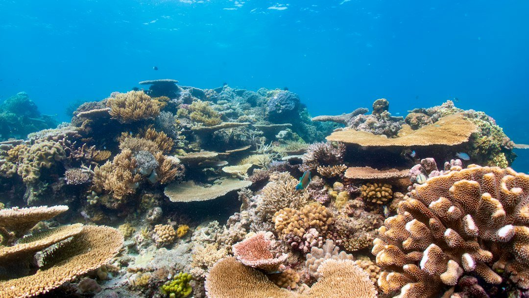
How to color correct underwater photos in Lightroom starts with the familiar moment when a promising reef shot opens on your screen looking almost entirely blue or green. Start with white balance. Underwater color correction is less about making every image warm and more about rebuilding believable color for the depth, visibility, subject distance, and light that were actually present when you pressed the shutter.
Light behaves differently underwater because water absorbs wavelengths as depth increases, with reds disappearing early and oranges and yellows following as you go deeper. Blue remains. Suspended particles also scatter light, which lowers contrast and can add a cyan or green cast that global temperature adjustments alone will not fix. A photo taken at 5 m in clear tropical water needs a very different correction than one taken at 20 m on an overcast day in temperate water.
How to color correct underwater photos in Lightroom
The most reliable post-processing steps are simple when you use them in order: choose the strongest file, correct white balance, set tonal range, treat the water and subject separately, then finish with detail work. Work slowly. Lightroom Classic, Lightroom desktop, and Lightroom mobile use slightly different panel layouts, but the controls have similar names and do the same basic jobs.
- Start with the RAW file. RAW retains substantially more color and highlight data than a JPEG, so white-balance and exposure adjustments hold together better. A JPEG can still improve, but heavy temperature shifts often create blotchy color or banding in open water. Check your file type before editing.
- Apply lens corrections first. In the Optics panel, enable profile corrections when Lightroom identifies your lens or camera housing setup correctly, then remove chromatic aberration if you see purple or green fringing near bright edges. Inspect the corners. Wide-angle underwater images commonly show dark corners, and correcting or retaining that falloff is an artistic choice rather than an automatic fix.
- Set a usable white balance. Use the eyedropper on a neutral gray, white slate, pale sand, or a genuinely white section of a fin if one appears in the frame. Avoid shiny reflections. If there is no neutral target, move the Temperature slider toward yellow and magenta until skin, sand, or a known subject color looks plausible instead of simply warm.
- Correct exposure before chasing color. Set Exposure for the subject, reduce Highlights if surface light or strobe reflections are clipped, and raise Shadows only enough to reveal useful texture. Keep an eye on the histogram. Bright water near the surface can be allowed to approach white, but important pale fish markings and coral detail should not turn into flat blank patches.
- Build contrast with restraint. Add a modest amount of Contrast, then use the Tone Curve or Blacks and Whites sliders to establish a clean black point and white point. Stop early. Underwater scenes often contain natural low-contrast water, and forcing deep blacks everywhere makes blue water look muddy while giving marine life hard, unnatural edges.
- Use masks for different distances. Select the subject with Subject Select, a brush, or an object mask, then make separate adjustments to the water background. This matters because the fish may need warmth and texture while distant water usually needs less saturation, less clarity, or a slightly cooler treatment.
- Adjust individual colors in Color Mixer. Tame excessive aqua and blue saturation before adding red or orange. Small corrections are safer. Increase orange or red only where those colors should exist, such as a fish, coral, diver’s wetsuit detail, or foreground sponge, rather than applying a broad global boost that turns all water purple.
- Finish at full size. Zoom to 100 percent to check noise, backscatter, halos, and edge detail, then zoom back out to judge the whole image. A correction can look impressive close up but fail as a photograph if the water no longer feels natural or the subject pulls attention for the wrong reason.
Choose the best starting frame
Good color correction cannot recover information that was never recorded. Keep that expectation realistic. Begin with the frame where your subject is closest to the lens, the sun angle is favorable, and the water contains the least backscatter, even if another frame has a more dramatic pose. Every extra metre of water between lens and subject removes contrast and warm color.
A photo with ambient light only usually needs more white-balance work than a photo lit by strobes or video lights, because artificial light restores warmer wavelengths near the foreground subject. Strobes change the job. You may end up cooling the strobe-lit animal slightly while warming or reducing the green cast in the surrounding water with a separate mask.
If you shot a white slate, gray card, or color reference at the same depth and under the same light, use that frame to establish a starting white balance and synchronize it to nearby images. This is efficient. Do not apply that setting blindly across an entire dive, because a change in depth, cloud cover, direction of travel, or strobe position can shift the color noticeably.
Set white balance without inventing colors
White balance is the first major color decision, and it controls how all later edits behave. The eyedropper is useful only when its sample is truly neutral. White sand can reflect blue water, gray slate can sit in a strobe hotspot, and a white fish belly can carry a natural cream or silver tone that should not be forced to neutral gray.
Use a visual check after the eyedropper. In a typical blue-water image, sand should look off-white or beige rather than electric cyan, reds should not become fluorescent, and water should retain a believable blue rather than shifting toward gray. Natural variation is normal. The goal is a convincing relationship between colors, not laboratory-neutral water.
Try this quick adjustment sequence when there is no neutral reference: move Temperature warmer until the subject stops looking cold, move Tint slightly toward magenta only if green remains obvious, then reduce either adjustment by a small amount. Pause there. That final step prevents the common correction where a diver’s skin, pale coral, or sand turns orange because the editor tried to replace every lost red wavelength at once.
For a green-water photo, do not assume Temperature alone is the answer. Green casts often need a small magenta Tint adjustment, followed by a selective reduction of green or aqua saturation in Color Mixer. Watch the shadows. Pushing magenta too far can make dark water look purple, which is usually more distracting than the original green cast.
Use masks to separate water and subject
Global edits are fast, but underwater scenes often contain two lighting worlds in one frame. The foreground subject may be lit by a strobe at a short distance, while the background contains only filtered daylight. Treat them separately. Lightroom masks let you correct each area without making one compromise that leaves both looking wrong.
Create a subject mask first, then inspect its edges closely around fins, whiskers, coral branches, and translucent parts of an animal. Refine it with Add or Subtract tools if needed. A sloppy mask is obvious. Warm the subject a little, lift shadows where useful, and add texture only if the file remains clean at 100 percent.
Invert that mask for the surrounding water, or use a linear gradient where the water changes progressively toward the surface. Lowering saturation a touch in the far water often creates more depth than increasing clarity. Keep distant water soft. It should recede behind the animal, wreck, reef wall, or diver instead of competing with it.
A practical example helps: if a turtle is correctly exposed but the water reads too cyan, leave the turtle mask close to neutral, reduce aqua saturation slightly in the background mask, and shift only that background a little cooler or darker. Make one small change at a time. This approach usually looks cleaner than warming the entire frame until the turtle becomes orange.
Control color with Color Mixer and calibration
Color Mixer is where a natural edit often succeeds or fails. Start with Aqua and Blue because they dominate many underwater files, especially wide-angle images. Reduce saturation before changing luminance. Lowering blue luminance can make water richer, but too much creates heavy navy patches and exposes noise in the shadows.
Then inspect Green, Yellow, Orange, and Red at high magnification on the actual subject. Coral colors are complicated. A red sea fan may contain orange, magenta, and shadowed burgundy, so raising the Red slider alone can produce strange magenta edges while leaving the main subject dull.
Calibration can shift the overall rendering of a RAW file, but use it carefully and only after a solid white balance and basic Color Mixer edit. Tiny moves matter. A small change to a primary hue may improve a camera’s cyan water response, while a large move can affect every color in the image and make matching a set of dive photos much harder.
If you edit a series from the same dive, finish one representative frame first, then copy settings to similar images and review each result individually. Do not batch export unchecked files. Fish moving closer to the lens, a strobe firing unevenly, or a change in shooting direction can make the copied correction unsuitable within seconds.
Restore contrast without making backscatter worse
Dehaze can be useful on a flat water column, but it is one of the easiest sliders to overuse underwater. Use a little. A strong Dehaze adjustment darkens particles, strengthens noise, and can turn ordinary suspended matter into harsh speckles across the frame.
Try this order instead: set blacks and whites, make a modest local contrast adjustment to the subject, then add only a small amount of Dehaze to the background if the image still needs separation. Check the corners. If the water looks gritty or the subject develops a bright outline, back off the last adjustment.
Clarity and Texture need the same restraint. Texture can reveal scales, coral polyps, or wreck surfaces without changing large edges as much as Clarity, while Clarity can help a flat subject when applied through a mask. Small values work. Global Clarity often makes backscatter and suspended plankton more visible than they were underwater.
Clean noise and backscatter last
Apply noise reduction after your major exposure and color changes, because lifting shadows can reveal noise that was not apparent in the untouched file. Examine dark blue water at 100 percent. Lightroom’s noise reduction tools can smooth ugly color speckling, but too much reduction erases fine detail and leaves fish scales or coral texture looking waxy.
Backscatter requires judgment. The Healing tool can remove isolated bright particles that pull the eye away from a subject, particularly against dark water, but cloning dozens of particles across a frame can create repeating patterns or erased texture. Fix distractions first. Leave ordinary water texture when it does not dominate the photograph.
Sharpening comes near the end. Mask sharpening so smooth water receives little or no additional sharpening, while the animal’s eye, face, or useful foreground detail gets the benefit. A sharp eye matters. No sharpening setting can rescue motion blur, missed focus, or a subject that was too far away in poor visibility.
Export for the place people will see it
Before export, compare the edited image against the original with Lightroom’s before-and-after view and ask one direct question: does this still look like underwater light? If the answer is no, reduce the last few color and contrast adjustments. Subtle edits age better. They also make a gallery from one dive look consistent instead of wildly different frame to frame.
For online sharing, export an sRGB JPEG at the pixel dimensions required by the site or social platform, then inspect the exported file on a second screen if accurate color matters. Keep the edited RAW and Lightroom settings. Export settings change. Print labs and portfolio sites may request different dimensions, color spaces, or file sizes, so verify their current requirements before sending final files.
Better capture makes editing easier on the next dive: get closer rather than zooming through water, set a custom white balance or use a reference slate when practical, and review exposure without losing awareness of your buddy and surroundings. The camera comes second. Photography should never distract from the dive plan, gas management, or the conditions your certified instructor or dive professional has taught you to respect.
Related posts
This article is for general informational purposes only and is not dive training or medical advice. Always train with a certified instructor and consult a doctor before diving if you have any health concerns. Gear specs, pricing, site conditions, and operator schedules change, so verify current details directly with the manufacturer or dive operator.
Disclosure: This post may contain affiliate links. If you click through and make a purchase, we may earn a commission at no extra cost to you. We only recommend gear we’ve researched or genuinely believe in.